By Greg Mills
While I try wax eloquent in my occasional digs at Microsoft CEO Steve Ballmer and all things Windows, it takes an actual PC fan boy to roast 'em right. Jakob Nielsen, described as a "user interface guru," slammed Windows 8 so hard the glass broke.I try to inject a little humor in my criticism, but Nielsen chops em up like stew meat on a butcher block. Nothing funny about it.
Calling Microsoft's business survival critical incremental release of Windows 8 a "monster and a tortured soul" goes beyond my normal bite out of Ballmer's hide. Since I wouldn't even touch a PC without wearing rubber gloves, my information is pretty much second hand. You can see the Nielsen article at www.useit.com/alertbox/windows-8.html .
When you read the entire article, what jumps out is that Microsoft's attempt to merge what in the Mac world would be OS X and iOS into one system. Apparently, trying to serve two platforms is a flop. Taking a hint from Apple isn't new for Microsoft; however, getting it right is never happening, it seems. While we have seen popular features of the Mac OS X show up in the mobile iOS platform and vice versa, the operating systems remain distinctly unique. Microsoft figured they would beat Apple to the punch and merge a touch and conventional OS. However the results are disastrous.
Microsoft has attempted to use touch screen gestures, but couldn't overcome two basic issues: Apple's patents covering the most logical user interface touch screen gestures and the knee jerk "Microsoft mentality" that firmly bonds them to the past.
While the colorful tiles of Windows 8 have functions, Nielsen complains that critical functions that users want and actually use are buried and hard to find. While it takes a while to change people's user interface habits, Nielsen thinks Windows is so hard to use it will flop. Trying to merge tablet and PC functions is bound to confuse PC users who have already suffered incredible learning curves.
A bloated operating system isn't such a problem for a PC that has plenty of storage, but is a serious problem for a tablet that has limited and unmodifiable RAM installed. Heck, Microsoft is already being sued for false advertising over the amount of actual free memory in Surface tablets. Rather than running a slimmed down and minimalist tablet OS like Apple's iOS, the Windows 8 Tablet OS eats RAM for lunch and leaves little of the 2 Gigs left over for Apps.
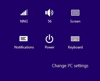
Nielsen really knows Microsoft Windows 8 as running multiple windows with a small window within a window failed to even work in his tests. He watched 12 experienced PC users flounder using a Surface tablet running Win8, as he calls it. Further, Nielsen dings Microsoft over a "flat" graphical interface where logos remind you of yesteryear. He shows a graphic of logos that reminded me of the old Mac 5 or 6 era. This isn't artistic, it's amateurish.
Nielsen states; "Icons are flat, monochromatic, and coarsely simplified. This is no doubt a retort to Apple's overly tangible, colorful, and extremely detailed 'skeuomorphic' design style in iOS. For once, I think a compromise would be better than either extreme. In this case, we often saw users either not relating to the icons or simply not understanding them. Icons are supposed to (a) help users interoperate the system, and (b) attack clicks. Not the Win8 icons."
Keep in mind that Nielsen watched 12 experienced PC users flounder to confirm his criticism. One wonders how many patches, upgrades and releases it will take for Microsoft to catch up to basic iOS functionality. Even Google doesn't make such basic mistakes in the Android OS.
No one using a gesture-based touch system has not seen gestures "misunderstood" by the OS. From what Nielsen says, iOS users would be appalled at the frustration Win8 touch users suffer. Finally, Nielsen stabs the bull thought the heart with the conclusion that Win8 has error prone gestures and is weak on tablets and terrible on PCs.
What all this means for us Mac fans is that the decline and fall of the PC monopoly will only increase in a cascade effect. Apple is likely to inherit a growing following for all the reasons Microsoft is failing. At Apple they do user interface right.
That is Greg's Bite.


